Definition 2.2.1.
-
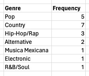
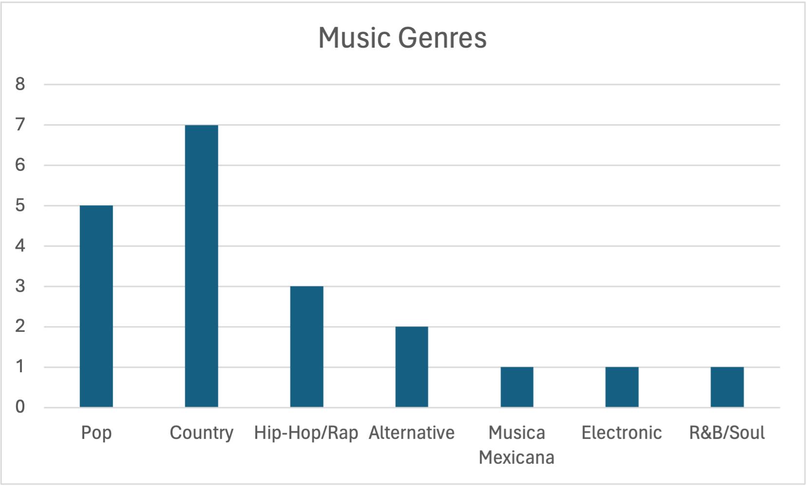
bar chart: useful for displaying qualitative data that is organized in categoriesDashboard with an example
1
bit.ly/3PhqoWl -
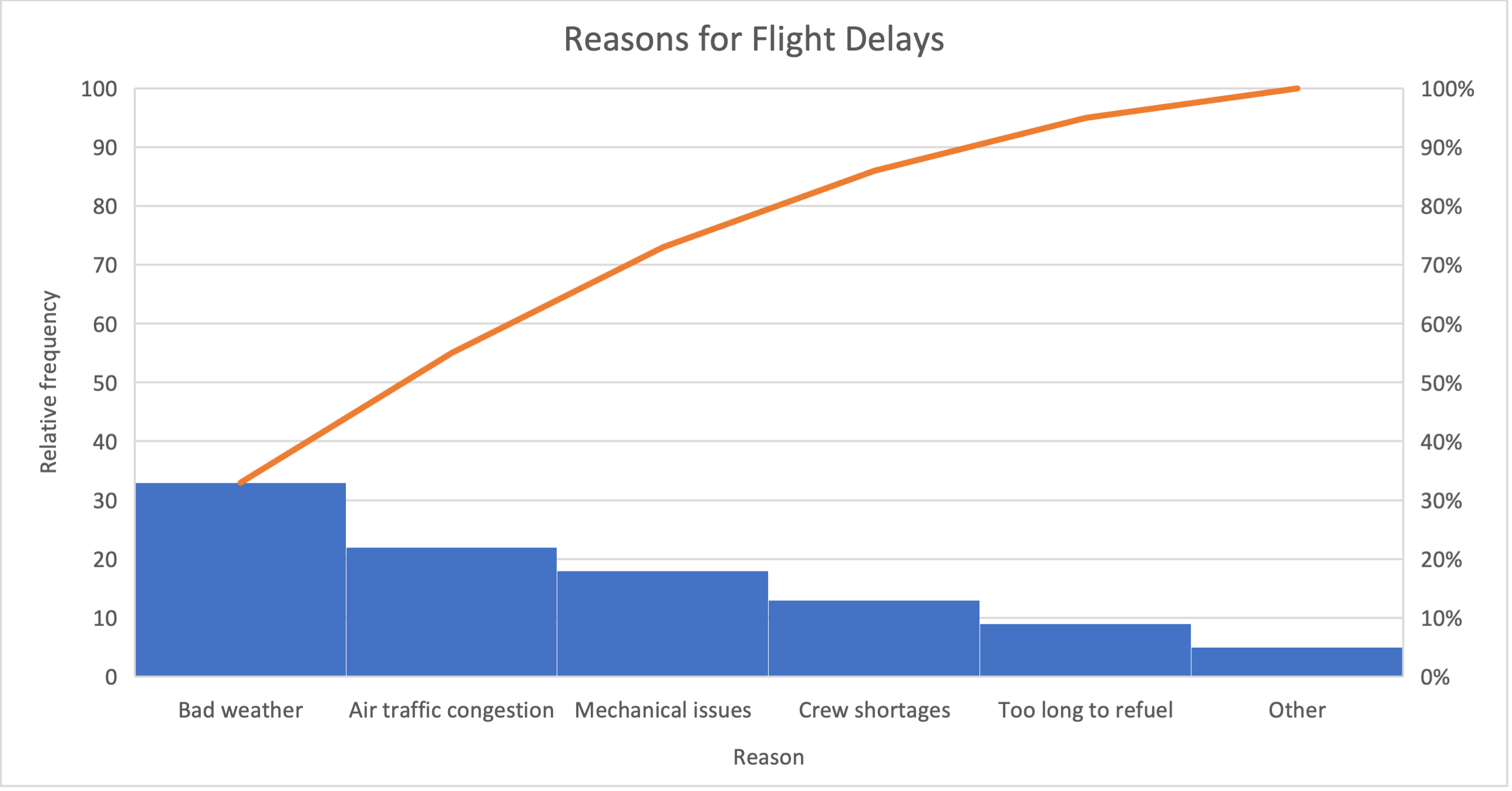
horizontal bar chart: has bars displayed in a horizontal directionDashboard with an example
2
bit.ly/445JMtQ