
QUAN 2010 Notes Introduction to Business Statistics

Section 2.1 Quantitative Data Displays

Definition 2.1.1.

  • frequency distribution: a table that shows the number of data observations that fall into specific intervals or categories
  • class: a category in a frequency distribution
  • relative frequency distribution: displays the proportion of observations of each class relative to the total number of observations
  • cumulative frequency distribution: totals the proportion of observations that are less than or equal to the class at which you are looking

Subsection 2.1.1 Creating Frequency Distributions in Excel

Let’s discuss these definitions in the example below:

Exercise 2.1.2.

Exploration 2.1.1.

Let’s look at the file below, which has the number of iPads sold at a particular store over a certain number of days. We’re going to make a frequency distribution for this data. external/sheets/iPadSales.xlsx
(The manager might want to know, for example, the percentage of days that 3 or fewer iPads were sold.)
Here is the frequency distribution we should get when we do this:

Subsection 2.1.2 Creating Histograms in Excel

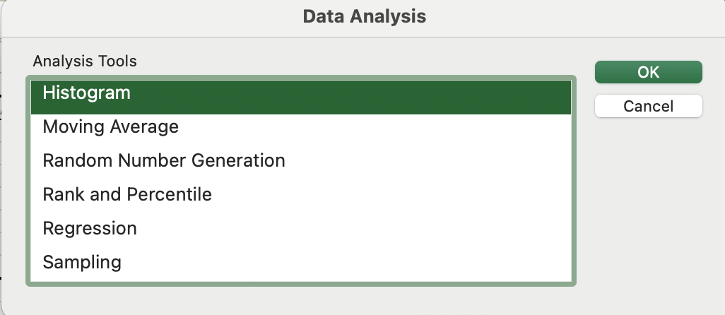
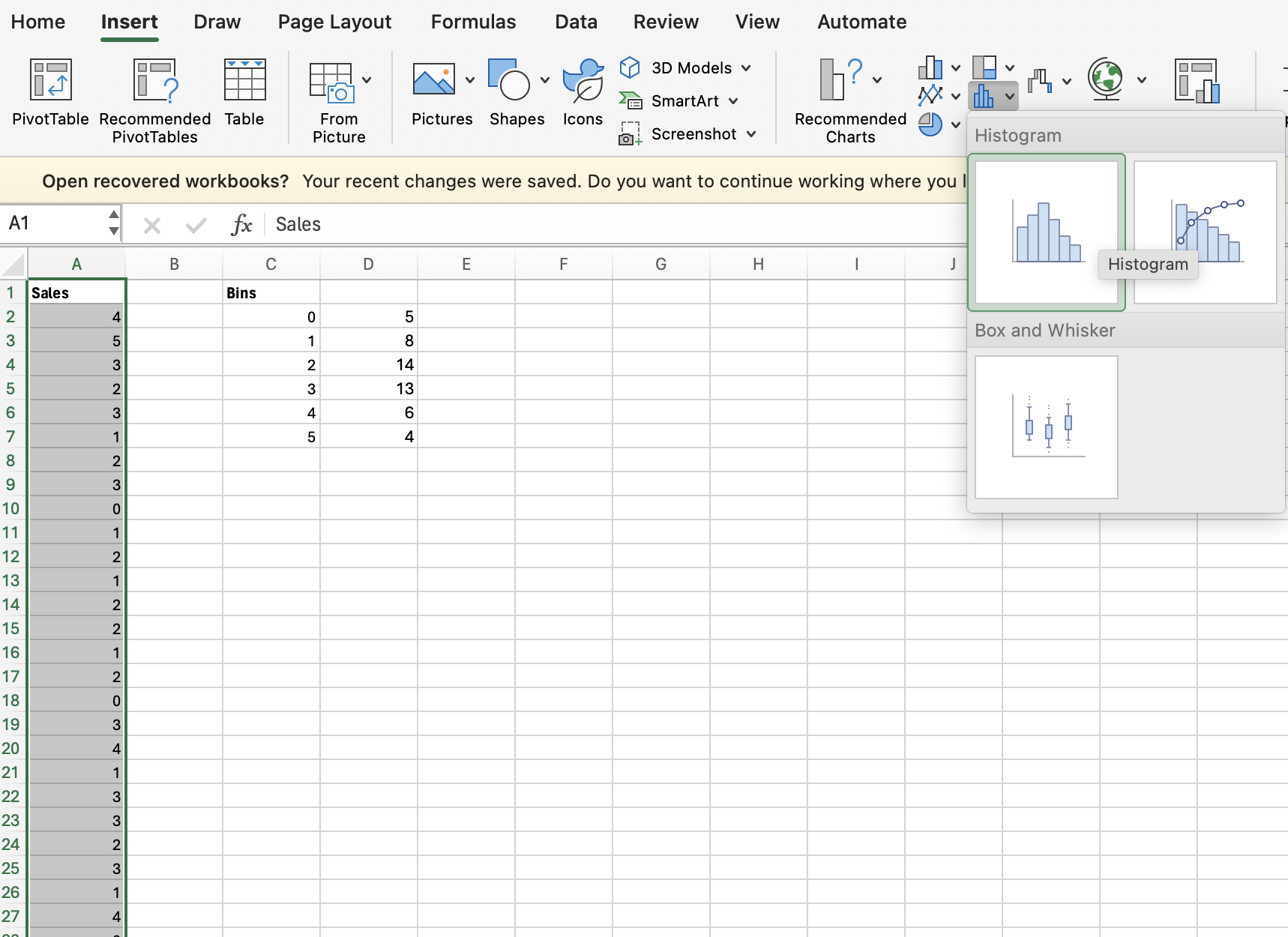
Next we want to create histograms in Excel, but before doing that, we’re going to download the Data Analysis tool in Excel that we will use to create histograms. (Later in the course we will use this tool for many more things!)

Exploration 2.1.2.

Let’s go back to the iPad sales example from ExplorationΒ 2.1.1.
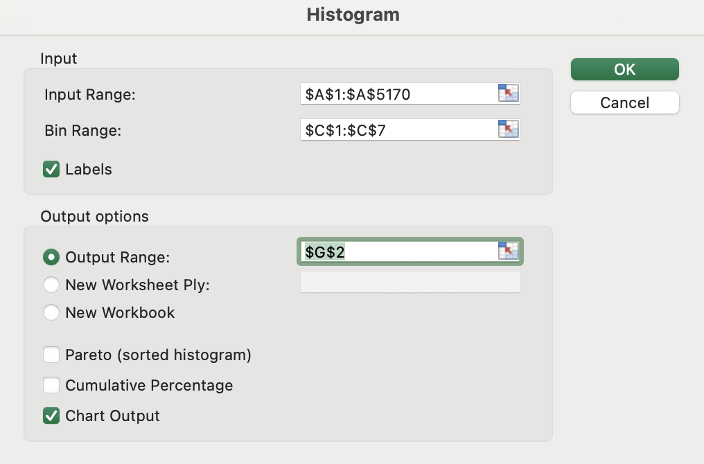
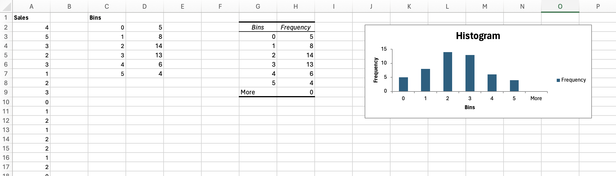
We’re going to create a histogram for this data in two different ways. First we’re going to create a histogram using the Data Analysis tool that we just downloaded.
  • In the Excel file, go to the Data tab, and then on the right click on β€œData Analysis”. (If β€œData Analysis” is not showing up, then the add-in has not been installed yet.)
  • Choose the β€œHistogram” option.
  • Choose the data as the β€œInput range”, specify the bins, choose β€œChart Output”, and specify the output range.
Here is the histogram and frequency distribution that we get by following these instructions:
Does the frequency distribution that we got using the Data Analysis tool match the frequency distribution we got in ExplorationΒ 2.1.1?

Exploration 2.1.3.

Now let’s create a histogram using Excel Charts instead of the Data Analysis tool.
Go back to the iPad sales example from ExplorationΒ 2.1.1.
  • Select the data (A1:A51) and then go to β€œInsert” and choose the Histogram option:
  • Here is what we should get when we do this:
Does the chart we got here look as good as the one we got using the Data Analysis add-in?
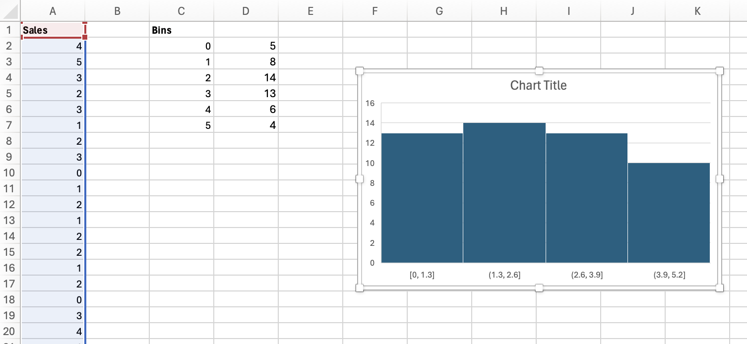
There are some tweaks that we will make to the chart we got here to make it looks better, but the chart we created using the Data Analysis tool looked much better without having to do extra work tweaking it.
(There are more details in the textbook about the steps we’ll work through in class.)

Activity 2.1.4.

(Optional)
Figure 2.1.5. Frequency and Relative Frequency Distributions (Made in GeoGebra by David Gurney)

Subsection 2.1.3 Grouped Quantitative Data

β€œ\(2^k\geq n\) Rule:”

Definition 2.1.6.

\(2^k\geq n\) Rule:
If we want to decide how many classes to use in a frequency distribution or histogram, we can let
\(k\) \(=\) number of classes
\(n\) \(=\) number of data points
The goal is to find the lowest value of \(k\) that satisfies the inequality \(2^k\geq n\text{.}\)

Example 2.1.7.

Once the number of classes, \(k\text{,}\) is decided, we must determine the width of each class. The width is the range of the numbers that are put into each class. The following formula calculates a good width:
\begin{equation*} \boxed{\text{Estimated class width: } \frac{\text{Maximum}-\text{Minimum}}{k}} \end{equation*}

Exercise 2.1.8.

Let’s look back at the file from ExampleΒ 2.1.7.
We found that \(k=6\) is a good choice for the number of classes, and let’s use that the find a good width to use for each class.
Answer.
Estimated class width:
\begin{equation*} \frac{17.4-0.6}{6}=\frac{16.8}{6}=2.8 \end{equation*}
Let’s round up to a useful whole number that makes the distribution more readable:
\begin{equation*} \text{Class width}=3 \end{equation*}

Exercise 2.1.9.

Exercise 2.1.10.

In ExerciseΒ 2.1.9 you created a frequency distribution for the data in the Dell Hold Times file.
Let’s use Excel to create a frequency distribution without having to count the number of items in each class ourselves.
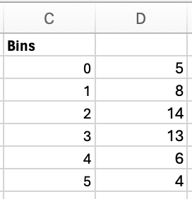
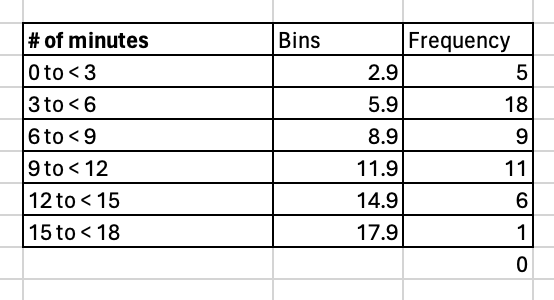
In the file below, we’re going to create a β€œBins” column that has an upper bound for each class, and then we’re going to use the bins to create the frequency distribution. external/sheets/DellHoldTimesFrequencyBins.xlsx
  • In the β€œBins” column, enter an upper bound for each class. (For example, in E9, we could enter \(2.9\text{.}\))
  • Our Bins are in Column E in the file above. Now highlight F9:F14 and type =FREQUENCY(A2:A51, E9:E14). Then hit enter.
Answer.
We should get the frequency distribution below when doing this.

Exercise 2.1.11.

(Donnelly 2.9)
The table in the Excel file below lists the receipt total for 350 randomly selected customers for the home improvement store Lowe’s.
  1. Using Excel and the \(2^k\geq n\) rule, construct a frequency distribution for the data.
  2. Using the \(k\) found above, calculate the relative frequencies for each class.
  3. Using the results from above, calculate the cumulative relative frequencies for each class.
  4. Construct a histogram.
Answer.

Subsection 2.1.4 Shapes of Histograms

Definition 2.1.12.

  • A distribution of data is symmetric if the right and left sides of the distribution are mirror images
  • A distribution of data is skewed if a large number of data items are piled up at one end or the other, with a β€œtail” at the opposite end.

Exercise 2.1.13.

Figure 2.1.14. Shapes of Distributions (Made in GeoGebra by Samantha Garcia and Lauren Nelsen)

Subsection 2.1.5 Scatter Plots

Definition 2.1.15.

Scatter plots provide a visual of the relationship between two quantitative variables -- the independent and dependent variables.
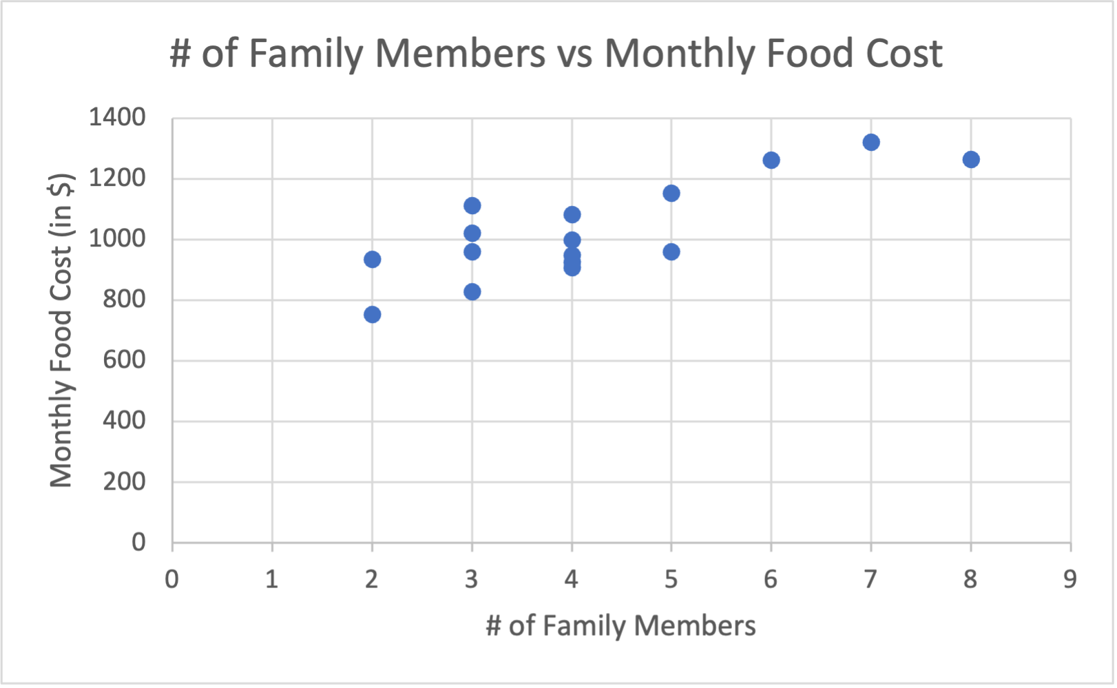
  • The dependent variable is placed on the vertical axis of the scatter plot and is influenced by changes in the independent variable, which is placed on the horizontal axis.

Exercise 2.1.16.

Let’s look at the example below with home prices and square footage:
Figure 2.1.17. Scatter Plot powered by Desmos
What is the independent variable and what is the dependent variable?
Answer.
The independent variable is the square footage, and the dependent variable is home price. (The home price depends on the square footage.)

Exercise 2.1.18.

(Donnelly 2.58)
A marketing research firm would like to display the relationship between a family’s monthly food costs and the number of family members living in a househould. The data in the Excel file below contains the monthly food costs and the number of family members for 16 families. Construct a scatter plot and describe the relationship between the number of household members and the family’s monthly food costs.
Answer.