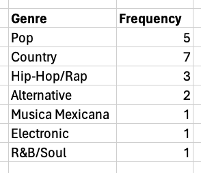
Qualitative data is handled differently when displayed, but you are already familiar with many of these different types of charts. We quickly summarize them below.
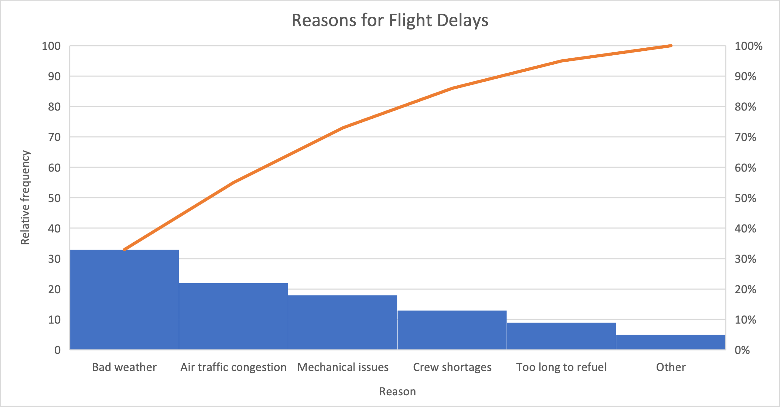
The table in the Excel file below shows an airline company’s flight delay data. The table shows the reasons for the delays and the relative frequency of each type of delay. Construct a Pareto chart for the data.
Contingency tables (known as pivot tables in Excel) provide a format to display the frequencies of two qualitative variables. Contingency tables allow one to identify relationships bewteen two or more variables.
A regional manager at Macy’s compares customer satisfaction ratings (1,2,3, or 4 starts) at the company’s Medford, Iowa, store (M); Eden, Iowa, store (E); and Darby, Iowa, store (D). The table in the Excel file below shows data from 50 customers. Use Excel to construct a contingency table. What conclusions can be drawn about store location and customer satisfaction?