
Section Viz Extensions and Dashboard Extensions in Tableau

Subsection Sankey Chart using a Viz Extension in Tableau

An example of a chart that can be made using a Viz Extension in Tableau is a Sankey Chart.
(This is a relatively new feature from a couple years ago.)
Sankey charts can be helpful for showing “flow”, such as the flow of money like in the image below from the budgeting software Monarch.
We’re going to see how to use a Viz Extension in Tableau to create a Sankey chart.

Example 8.5.

Use a Viz extension in Tableau to create a Sankey chart for the 2023 NBA playoff data below to get an image like the one shown.
Questions to consider:
  1. Is this the best way to visualize this data?
  2. What is wrong with the way colors are being used in this chart? (How could the chart be improved?)

Example 8.6.

The file below contains information about some of the passengers on the Titanic and whether or not they survived. external/sheets/titanic.csv
Use a viz extension in Tableau to create a Sankey chart like the one below:
(You’ll need to create a calculated field.)

Subsection Dashboard Extensions in Tableau

We’ve made dashboards in Tableau, but there are a lot of extensions that can take our dashboards to the next level.
In the problem below, we’re going to use the Image Map Filter dashboard extension in Tableau.

Example 8.7. Store Profit Image Map Filter Example.

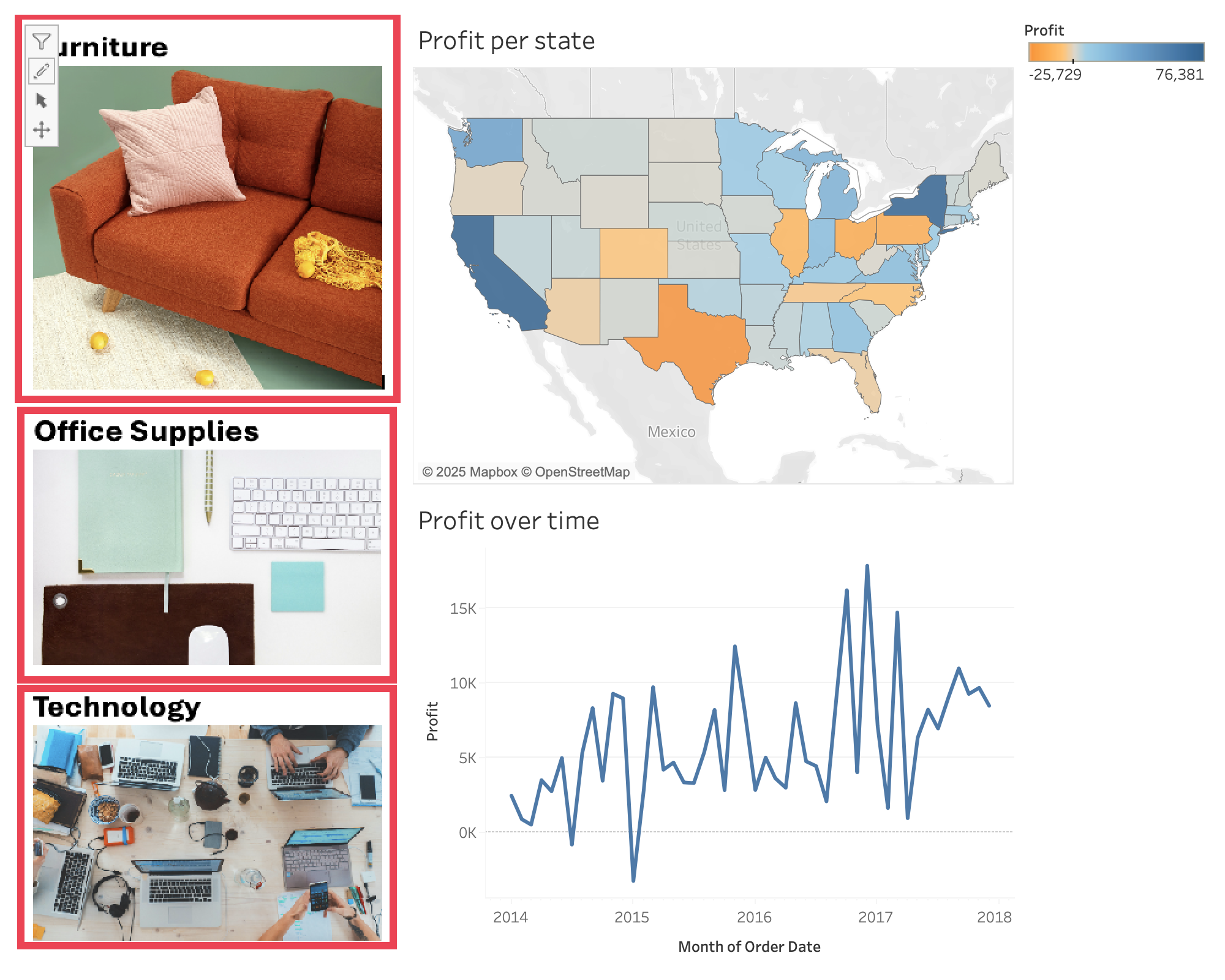
In this problem, we’re going to create a dashboard like the one at the link below. (You will likely need to be signed in to Tableau Public to view and interact with the dashboard below.)
Link to Dashboard
 2 
public.tableau.com/views/Superstoredashboard_17331671994430/Dashboard1?:language=en-USpublish=yes:sid=:redirect=auth:display_count=n:origin=viz_share_link
To do this, we’ll need the Excel file with the data, as well as the image that we’re using to represent the different categories:
Create two charts in Tableau:
  1. A map shading each state with the total profit
  2. A line chart showing profit over time
Add “Category” to Filters on both of these sheets.
Now create a dashboard and add both of these sheets to your dashboard.
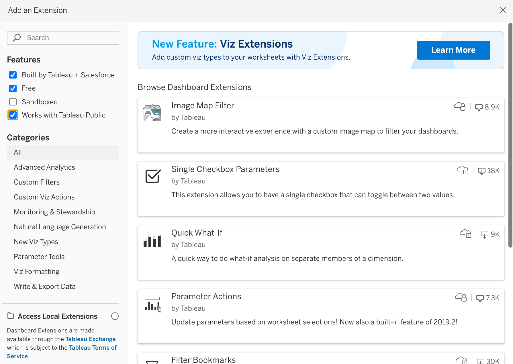
Next we’re going to add the “Image Map Filter” extension to the dashboard:

Example 8.8. Filter Bookmarks Example.

Use the file below to create a dashboard showing inflation-adjusted salaries over time and showing a boxplot of all inflation-adjusted salaries. (Include any other visualizations you think would be helpful for visualizing this data.)
We’re going to use one of the images below with the Filter Bookmarks dashboard extension to create a dashboard like the one below.
Link to Dashboard
 3 
public.tableau.com/app/profile/lauren.nelsen/viz/NBASalaries_17648118218800/Dashboard1?publish=yes

Example 8.9. Ski Area Ownership Image Map Filter Example.

In this problem, we’re going to create a dashboard like the one below:
Link to dashboard
 4 
public.tableau.com/app/profile/lauren.nelsen/viz/SkiAreaOwnership/Dashboard1?publish=yes
Use the Excel file and image below:
Create a dashboard using the dataset and use the “Image Map Filter” extension to filter by state location of the headquarters.